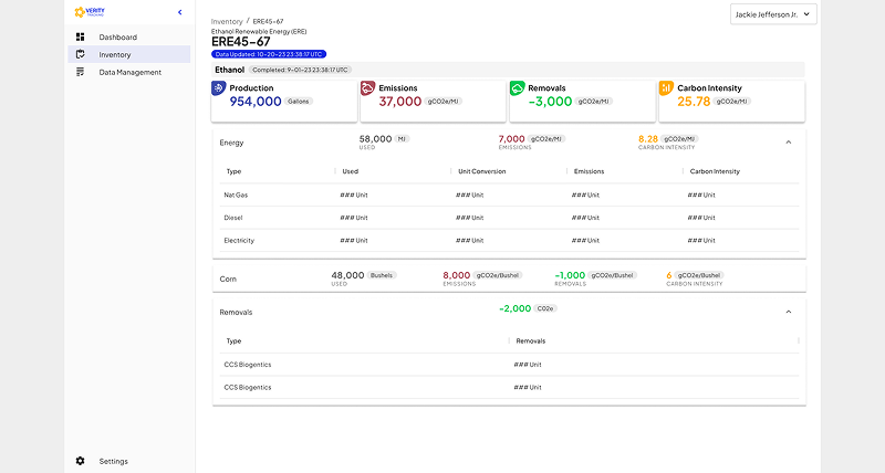
Corn to Ethanol

A unified emissions dashboard that simplified complex agricultural carbon data, empowering farmers and ethanol producers to track, verify, and report sustainability metrics with clarity and confidence.
Problem
Core issues and why it matters
Business Problem:
Gevo needed a way to visualize and quantify carbon emissions across the agricultural supply chain — from corn cultivation to ethanol production. Without a centralized dashboard, farmers couldn’t prove their low-emission practices, limiting access to premium markets and sustainability credits, and ethanol producers struggled to verify and report supplier emissions data.
User Problem:
Farmers lacked digital tools to track and report emissions efficiently. Ethanol producers couldn’t easily validate emissions data from multiple suppliers. Workflows relied on spreadsheets, phone calls, and manual entry, making data reporting slow, error-prone, and inaccessible for non-technical users.
Technical Problem:
Existing systems were fragmented, with inconsistent data pipelines across regions. The UI had to accommodate complex scientific data while remaining simple enough for farmers with limited digital literacy.
Why it matters:
Solving this problem enabled transparent emissions reporting, faster compliance, and opened revenue opportunities tied to sustainable agriculture, directly aligning business, user, and technical objectives.
Challenge
Constraints and complexity shaping the solution
- Tight timeline: MVP had to launch within 7 months.
- Diverse user base: farmers with low digital literacy vs. scientists needing precision.
- Fragmented data pipelines: inconsistent formats and manual reporting.
- Limited engineering resources: dashboard needed to be feasible for a small dev team.
- Scientific rigor: the solution had to accurately reflect emissions data for regulatory and compliance purposes.
Design approach: Embraced simplicity for users while maintaining scientific validity, prioritizing essential metrics for the MVP with scalability for advanced analytics in future iterations.
Strategy
UX strategy and north-star direction
Experience Principles:
- Clarity over complexity: users should understand emissions trends at a glance.
- Empowerment: enable farmers to self-serve emissions reports.
- Transparency: allow ethanol producers to validate supply chain data.
- Scalability: dashboard should evolve from MVP KPIs to full supply chain visualization.
Hypotheses:
- If we centralize emissions data in one dashboard, farmers will spend less time preparing reports.
- If we provide clear visual storytelling, ethanol producers will have more confidence in supplier data.
Future-State Vision:
A unified, self-service emissions reporting platform connecting corn cultivation to ethanol production, giving all stakeholders actionable insights while supporting sustainability goals.
Business Impact Rationale:
This approach accelerates compliance, improves transparency, and unlocks economic incentives for sustainable practices.
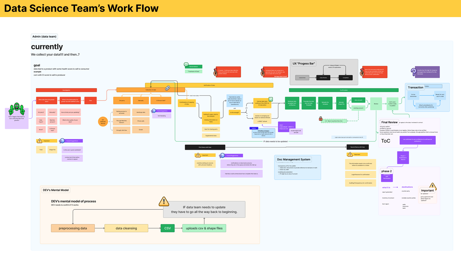
UX Work
Research, flows, testing, and iterative design work
- Conducted extensive learning sessions with farmers, producers, scientists, and sustainability experts.
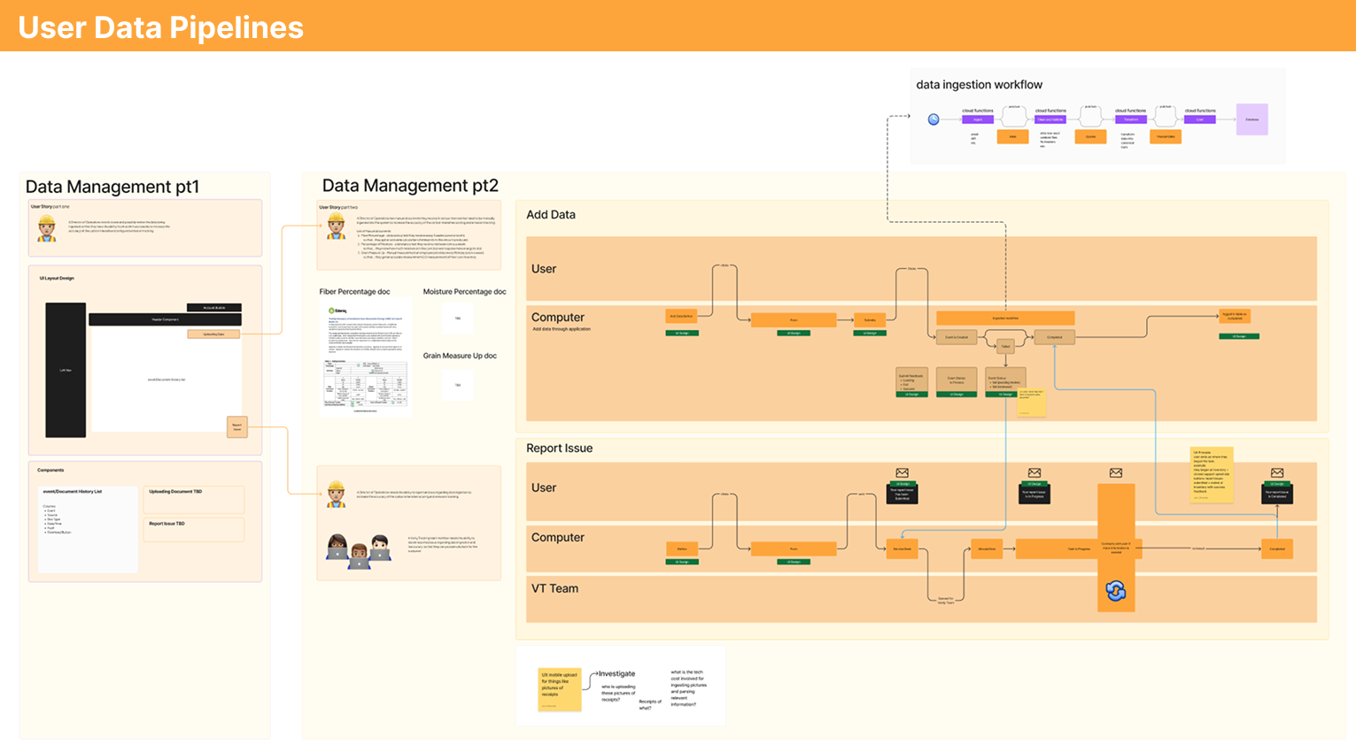
- Mapped fragmented workflows and identified data acquisition as the key bottleneck.
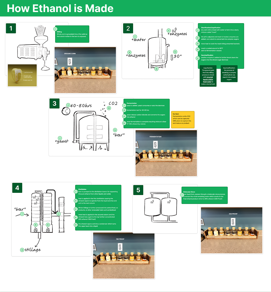
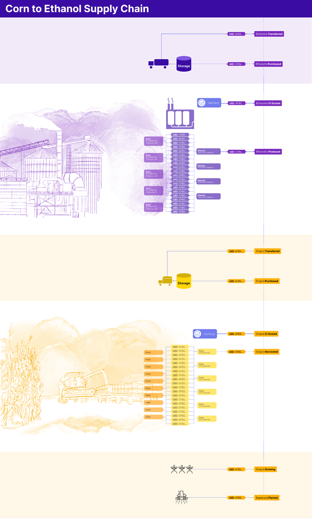
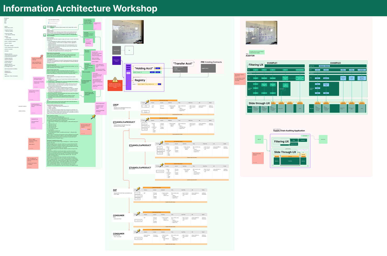
- Developed IA and flow diagrams connecting corn production data to ethanol processing metrics.
- Created low- to mid-fidelity wireframes to test layouts balancing clarity and analytics.
- Iterated prototypes using usability heuristics (visibility, recognition over recall) and accessibility best practices.
- Tested with SMEs to refine terminology, chart interactions, and visual hierarchy.
Key insight: Visual storytelling (trends over time) improved comprehension compared to raw tables.
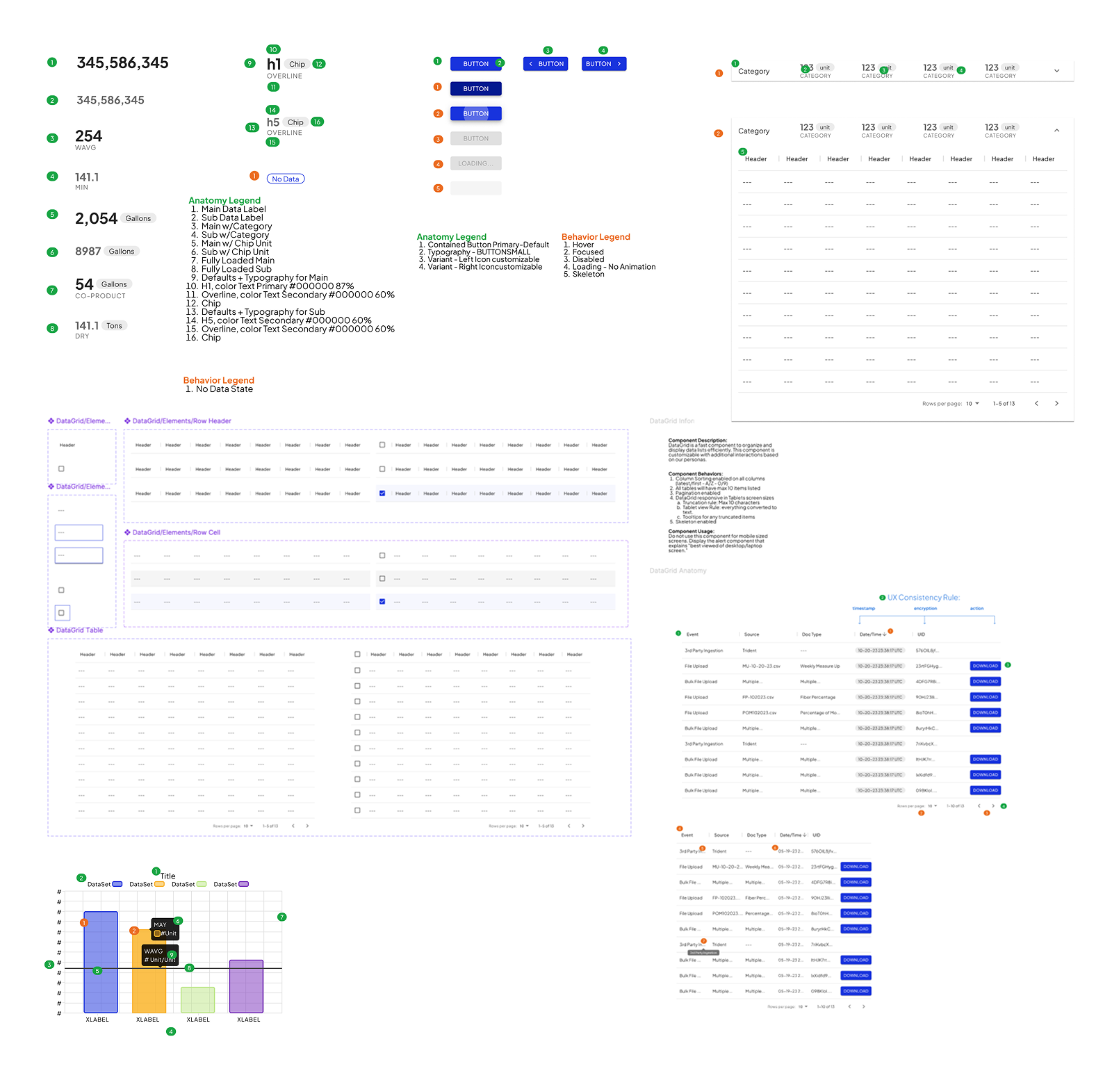
ui design
Systemized components and refined interaction states
- Built a modular, data-driven design system in Figma.
- Components included charts, filters, report summaries, and responsive layouts.
- Defined typography, color, and spacing tokens to ensure consistency.
- Interactive prototypes allowed seamless testing with real-world data.
- The design system enabled engineers to adopt scalable patterns, reducing rework and accelerating future feature development.
Result: Dashboard UI is flexible, accessible, and future-proof for supply chain analytics expansion.
collab
Cross-functional executions
- Partnered with CPO, lead engineer, data scientists, and frontend team throughout ideation, prototyping, and launch.
- Managed handoff via Figma Inspect, Confluence documentation, and Jira tickets.
- Conducted Q&A sessions to clarify interactions, data states, and responsive behavior.
- Maintained a continuous feedback loop with engineers to ensure feasibility of dynamic charts and loading states.
- Coordinated with agricultural SMEs to validate usability in real farming scenarios.
Evidence: Stakeholders and investors experienced a near-live prototype; early visual reviews ensured alignment with business goals.
Impact
Real outcomes in efficiency, adoption, and scalability
- Users (Farmers and Ethanol Producers)reduced emissions reporting time by 35%.
- Producers gained confidence in supply chain transparency.
- MVP adoption exceeded expectations in early beta testing.
- Dashboard established a functional proof of concept for scalable sustainability reporting.
- Leadership recognized the potential to extend the framework to other renewable fuel programs.
Qualitative: Users reported a tangible sense of control over sustainability; visual storytelling helped link emissions savings to economic benefits.
Key takeaway: Providing context alongside data is critical — numbers alone don’t drive action.
Design Artifacts